Usability guru Jakob Nielsen has slammed Microsoft's new Windows 8 operating system, accusing the company of hiding everyday features, imposing a tablet paradigm on desktop users, as well as a single-window user interface instead of enabling users to set-up their desktop "estate" in the way that they want to.
Microsoft's mobile operating systems hit by Wi-Fi problems and random re-boots Windows 8 creator Steven Sinofsky resigns from Microsoft Microsoft will die and disappear in the next few years, says ex-BT CTO
"With the recent launch of Windows 8 and the Surface tablets, Microsoft has reversed its user interface strategy. From a traditional Gates-driven GUI style that emphasised powerful commands to the point of featuritis, Microsoft has gone soft and now smothers usability with big colorful tiles while hiding needed features," wrote Nielsen in his blog.
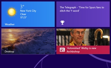
He adds: "The product shows two faces to the user: a tablet-oriented 'Start' screen and a PC-oriented desktop screen. Unfortunately, having two environments on a single device is a prescription for usability problems for several reasons.
Users have to learn and remember where to go for which features; When running web browsers in both device areas, users will only see (and be reminded of) a subset of their open web pages at any given time; Switching between environments increases the interaction cost of using multiple features; The two environments work differently, making for an inconsistent user experience. Nielsen wrote his report after in-depth testing of Windows 8 with 12 "experienced PC users".
He reserved his most stinging criticism for the operating system's inability to display more than one window at a time – a throwback to the early Windows operating systems of the mid-1980s and early 1990s. Indeed, it was only with Windows 7 that Microsoft finally offered such features as gestures enabling two windows, such as a browser and a Libre Office document – to be opened side-by-side.
"The product ought to be renamed 'Microsoft Window'," wrote Nielsen.
That feature shortcoming makes it difficult for users to consume and use information.
"When users can't view several windows simultaneously, they must keep information from one window in short-term memory while they activate another window. This is problematic for two reasons. First, human short-term memory is notoriously weak and second, the very task of having to manipulate a window – instead of simply glancing at one that's already open – further taxes the user's cognitive resources."


