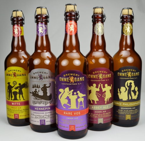
Ommegang Brewery has worked with Duffy & Partners, Flower City Printing and AR Metallizing to introduce new packaging look for its line of beers, which would have better shelf appeal.

The brewer's aim was to create a new look that would have brand recognition while sending the quality message of the Belgium style ales.
As part of the new packaging, branding and design company in the US, Duffy & Partners created a new logo and label design that gave the beer line a unified branded look and also also evoked the look of quality the Belgium style ales are known for.
Print partner Flower City Printing, which tried with various techniques, has suggested metallized paper from AR Metallizing to support the pearlescent look desired that aims to duplicate traditional look on craft beers.
Brewery Ommegang communications director Larry Bennet said, "The beauty of this label is the simple yet elegant use of the silver metallized paper as a part of the design, giving the bottle a look of subtle, shimmering beauty."


