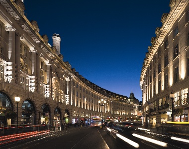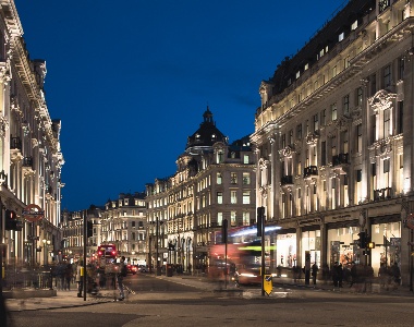
Over the past 17 years Studio-29 founder Tony Rimmer has transformed the lit appearance of London's prestigious Regent Street with a challenging lighting scheme adding depth and consistency to Regency thoroughfare's Grade-II listed facades. Jill Entwistle reports
The commission to light the entire length of Regent Street is either a designer's nightmare or nirvana. On the one hand, it is going to take about 20 years of your life, with all the commitment, occasional contention, and the changing technology and personnel that is likely to entail. On the other, there is the satisfaction of getting hold of one of London's most famous and architecturally gracious streets, designed by John Nash in the early 19th century, and controlling its lit appearance from one end to the other – with the bonus of a client who is prepared not only to back you but also to invest money in assiduously maintaining your scheme.
For Tony Rimmer, it was nirvana. "To be able to control a part of a city of such prominence and make the whole thing one cohesive design – and to have a client with the foresight and ability to make this happen – has been exceptional," he says.
Transformation
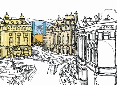
Rimmer now has his own practice – Studio-29 – but the project began when he was head of architectural lighting design at multi-disciplinary practice Imagination. Imagination was involved in more than just the lighting and had proposed all sorts of radical interventions, including a structural canopy over the entire street. This idea, together with other parties' proposals for a canal and a tramway, was not adopted, but other, more pragmatic plans remained.
The main ambition of The Crown Estate, which is the single owner of Regent Street, was to transform the street's image (at the time it was known for its preponderance of airline ticketing outlets and tourist tartan shops) with a coherent and long-term strategy. The aim of the 1 billion Regent Street Vision was to make it a London destination in its own right, rather than the tired thoroughfare that people mainly visited by default on their way to see Eros and other landmarks. Behind the scenes, this meant replacing the host of small tenants who inhabited a warren of offices in the street so that whole blocks – the street is divided into 20 – could be leased out to larger clients. This made implementing the Vision a simpler proposition and freed up capital for improvements – cleaning the original Nash buildings, widening pavements – and effected an upgrade to a higher calibre of retailer.

"Regent Street is one of the few complete architectural set pieces in central London," says Peter Bourne, development manager of The Crown Estate. "The programme to improve it involved creating a quality shopping centre, a successful business location and a place for people." Essential to knitting this vision together was the creation of a uniform lighting design.
"Applications were being received, typically from the larger stores, to light individual buildings," says Bourne. "It was decided that, instead, an overall scheme should be implemented, which would emphasise the quality of the architecture of the whole street, rather than particular individual stores." A gift to a lighting designer – heritage issues notwithstanding, of course – was the stylistic integrity of the listed Nash fa ades, which lent themselves well to modelling and made a consistent approach easier.
"The bonus was that all the fa ades were very similar," says Rimmer. "We picked up on the common cornice height [of the blocks], at fifth-floor level for instance, and the chamfered ends of each block, which are defined for views up and down the street. Certain buildings have different fa ades, such as the old Liberty building, which has a concave frontage with colonnades and steps back. But we could still apply the same principle." The principle was to create a generally warm white colour wash (2,800K-3,000K) and pick out architectural features – columns, sculptures, and so on – in a cool white (4,000K) to bring them forward, giving the fa ades depth and definition. The staple lighting source for the project has been ceramic metal halide and the key fitting has been Meyer's Superlight range (about 2,500 luminaires) handled in the UK by Commercial Lighting. Talk to any specifier and they will often be at least a little equivocal about some aspect of the kit or the service. Not Rimmer. For such a marathon effort he needed complete reliability and total back-up and, he says, he got it.
"Commercial Lighting has been unbelievably proactive," he says. "Meyer fittings have worked perfectly. It's such a simple-looking fitting, very discreet. If we had any problems, anywhere, they sorted it out within 24 hours. As a supplier and manufacturer, they were absolutely faultless."
Exemplary service
Meyer even developed fittings specifically for the project, including the Nano LED fitting. The length of such a project begs the question of how you maintain consistency, particularly in view of the inevitable transition to LED technology. Rimmer resisted LEDs for some time, until he was confident they were up to the job. "The Crown Estate had been asking for several years to look at LEDs but I was pushing them to stay with metal halide for the time being, until the technology was proven, more stable. The efficiency of the metal halide was far better than the LEDs because of the amount of lumens per watt you were getting out of them to light a fa ade of three or four floors. Even now I think what would we gain from changing CMH to LEDs if we're lighting three stories? It isn't worthwhile changing it just for the sake of it, unless there is a huge impact on energy consumption."
SPECIAL TREATMENTS
There were certain locations that cried out for LEDs, says Rimmer. "I've used them outside windows on the Meridien Hotel, for instance, because gaining access is almost impossible. You can't do it during the day because road closure isn't allowed, as it's a major bus route. You can't maintain them at night, because you don't want a guy on a cherry-picker looking through your window when you're in bed."
Elsewhere, the sculptural frieze of the old Liberty's facade would probably now be done with LEDs but highlighting was done very effectively with fibre optics, literally bringing it to light for the first time. Following the overall lighting principle, a warm wash to the frieze was achieved with cold cathode while the fibre optics pick out the details. The 150W/250W metal halide projectors are tucked behind the parapet wall so they can be maintained from the roof and a 4m-long hole was specially drilled at an angle to get the harness through to the foot of the frieze. Rather than dimming, Rimmer used negative density filters on each lens head to vary the intensity, creating highlights and low lights.
But, as the technology improved, Rimmer started trialling LED luminaires. Consistency of colour temperature was initially an issue.
"Some of the warm white LED fittings we were given looked very different in the office, compared with when we saw them against the actual buildings. We were getting some that were acid yellow and looked terrible. It came down to trial and error with different manufacturers, comparing fittings on the fa ade with the rest of the installation. But LED quality has improved so much over the past three or four years. An LED warm white is quite close to a metal halide warm white now."
Transition to LEDs
One of the crucial factors in ensuring consistency along the 1km route was incorporating an overall lighting strategy into the Regent Street tenancy guidelines. "Any retailer signing a lease had to follow the guidelines," says Rimmer. "No illuminated signs, no colour change, no moving lights." Sometimes, especially in the early days, it was difficult getting everyone to play ball. "In the beginning there were problems with certain buildings. The Austin Reed fa ade had orange windows on the whole block, for example. Directly opposite, the old Garrards Jewellers building was blue. "When Garrards moved out, Austin Reed wanted to do all of their windows blue. We had to try and persuade retailers to stop competing for prominence by using colour. It was a very hard thing to do, to achieve that consistency."

Raise the roof: Artist's impression of a proposal to cover Regent Street with a canopy
As well as what Rimmer describes as "coloured light wars", he also wanted to control light levels. "Because we could control the effect of the whole street, we could also dictate wattages. One of the buildings had 150W and 250W metal halide fittings on the fa ade. We said we didn't need to do that because we were controlling the whole environment. We took that down to 70W and 35W, and even to 20W in places."
What is encouraging is the rigorous approach to maintenance adopted by The Crown Estate. The organisation covers maintenance costs and has a 20-year strategy in place. "There's a full programme," says Rimmer. "It's not just a matter of maintenance when lights fail; it's done regularly, so that everything is kept looking 100 per cent."
THE REGENT STREET LIGHTING PLAN
Challenges
· To install a lighting scheme along the entire length of Regent Street, implemented in stages to coincide with stone cleaning and building developments over 20 years
· To co-ordinate separate lighting schemes over 20 distinct blocks to create a cohesive approach
· To maintain a reduced light level on the street, preventing light pollution and conflict between leaseholders
Solutions
· To reduce visual clutter on the building facades, standard light fittings were customised, with remote gear and drivers hidden from view
· For simpler maintenance, fibre optic projectors were used to light details and statues in hard-to-reach locations
· Framing projector units were projected in strategic locations on opposite sides of the street to highlight major statues and details where it was impossible to locate luminaries
Ease of maintenance
The level of traffic pollution in the street makes strict and regular maintenance essential. "In a matter of four weeks you'll have millimetres of grime all over the fitting and lose 30-40 per cent of the output," says Rimmer. "Originally all the Meyer fittings were done in a slightly off-white RAL colour to match the Portland stone. But we found that in a matter of weeks it weathered down anyway, so there was no point not having the standard white."
For easier maintenance, Rimmer has put every light fitting on a plug-and-play system so that if one fails, contractors can just unplug and replace it. "You don't need access to the building or to turn off the whole circuit while the guys work on it. It's more costly but in the long term it's cheaper for maintenance," he says.
It has been a dogged process, says Rimmer, but a satisfying one, and he has been as much project manager as lighting designer. "I've had to carry it through different managers and changes of plans, just constantly pushing it forward," he says.
The target for completion of the project, like so much else in London, was before the Olympics. In fact, Rimmer was down there focusing his own lighting during the Opening Ceremony.
He is now working on Lower Regent Street.


