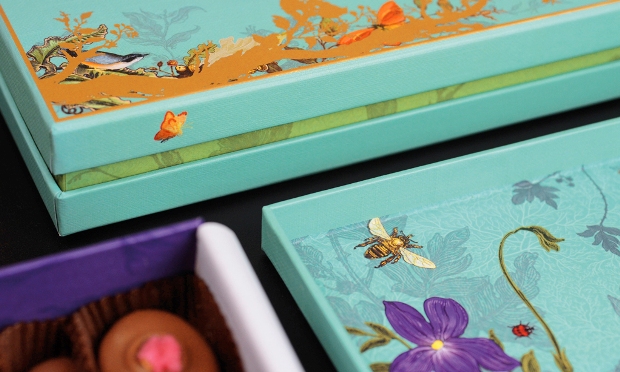
Design Bridge was tasked with delivering a deeper level of storytelling, craft and wonder, the packaging reflecting the provenance of ingredients.
The design team commissioned letterpress artist Jon Kielty at JMG Studio to re-design the glassine wrapper for the fudge range. Adding theatre and interest to the packaging, he also developed the distinctive lettering for the main sleeve, bringing the truffle boxes up to date with delicate hand-painting and incorporating a distinctive foil finish.
Chloe Templeman, design director at Design Bridge, said: “We looked to bring the uniqueness of each range to life with every detail – from the moment you open the box, to when you take out a chocolate, each stage unveils more of that particular story, truly delivering a sense of pleasure”.
Holly Kielty, creative director of brand language at Design Bridge, said tone of voice was key. “Careful attention was given to the tone of voice in every part of the pack, from front face, down to serving suggestion – adding a playful charm and sense of English wit that reflects the Fortnum & Mason brand.”


