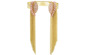
The 1970s is a decade that never seems to go out of style.

This fall, the fashion runways in New York were full of fringe, suede and flares plus plenty of autumnal colors, and jewelry is following suit.
Yellow gold is back in a big way--illustrated by both large, gold links and more delicate pieces with fringe--turquoise can been seen in a lot of pieces and there’s a definite penchant for layering, even if the price of gold today has dramatically reduced the size of chains and pendants for most people.
Patricia Faber, who co-owns New York City’s Aaron Faber Gallery with her husband, took the time to tell us about one very fun era in fashion.
What shaped the aesthetic of jewelry in the 1970s “I think it was driven by counterculture,” Faber said, meaning: Woodstock, LSD, rock music and people protesting against the war and pushing for civil rights.
“Counterculture people, the rock stars, were not buying high fashion, but high fashion started to look like what they were wearing. They were influencing [it].”
Yes, there was still bridal jewelry and traditional fine jewelry being made, but in the early 1970s there was also the mainstream acceptance of the youth movement, the hippie subculture, that began in isolated pockets in the mid-1960s. For example, Chanel came out with a long, flowy printed dress that looked like what hippies wore to the beach or to outdoor concerts like Woodstock.
As the decade wore on, clothing became more tailored but there were still bold color combinations, flared pants and loud prints (perhaps due in part to the LSD); think Pucci and the patterns on Diane Von Furstenberg’s then-new creation, the wrap dress.
Jewelry had to be bold to stand out against all the styles of this era, resulting in thick yellow gold chains worn in layers, brightly colored gemstones like turquoise and long beaded necklaces.
What else was popular during this era? Faber said the 1970s was also a time when jewelry artists were creating really large pieces.
“Nobody,” she said, “was afraid to be bold.”
David Webb and his outstanding animal cuffs were popular alongside well-known brands like Boucheron and Bulgari. There were also the big rings of London-based designer Andrew Grima, Cartier’s Aldo Cipullo creating chunky necklaces set with stones like jade and carnelian alongside the smaller gold pieces he’s so well known for, and Vivianna Torun making giant pieces under the Georg Jensen brand.
Donning big, bold jewels--including extremely oversized pieces of body jewelry--was a way of expressing oneself and experimenting with body decoration, much in the way that tattoos are used today.
“In jewelry, there were a lot of really wild pieces that were designed and made” in the 1970s, Faber said.
What gemstones and metals were popular? People wanted big, bold gemstones to stand out against their flowy outfits and loud prints, and that’s what they got.
Turquoise was widely used, as were malachite and lapis lazuli, with Faber noting that “When you are working in a large scale, something that is less expensive is desirable.”
As for metals, the decade was all about yellow gold, as the metal enjoyed continued popularity from the ‘60s. Faber said the warm hue fit in with the autumnal colors, the oranges and the browns, that dominated interior design in that era.
The popularity of gold in that era also had a more practical aspect: It was relatively inexpensive in the early years of the decade.
Before 1971, when President Richard Nixon took the United States off the gold standard, the price of gold was fixed at $35 an ounce. In today’s terms, this would be the equivalent of gold costing about $220 an ounce.
On average, the gold price stayed below $100 an ounce until about 1974, before it began rising in earnest toward the end of the decade, topping $600 an ounce on average by 1980, historical data from Kitco.com shows.
“So much of jewelry style comes from, can you get it? And, do you have the technology to work with it?” Faber observed.
Should retailers dive into the ‘70s resurgence and/or add some 1970s-era estate pieces to their inventory? Faber said it depends on the retailer and their customer because, like the Retro Modern (1940s) period, the design is very bold. It isn’t for everyone.
For those retailers who feel a connection to the era--and have a customer who would too--Faber suggested they buy a few 1970s estate pieces to mix in with the modern ‘70s-inspired looks.
This way, they can showcase the old alongside the new and have a story to tell customers: Here is an actual piece from the era contrasted with a modern designer’s take on that look today.
“It wasn’t necessarily an easy time,” Faber said of the 1970s. “But … it was a really fun period.”


