Posted by Lisa McTigue Pierce, Executive Editor -- Packaging Digest, 4/5/2013 10:25:45 AM

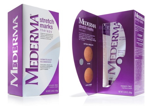
Mederma Stretch Marks Therapy is lighting up retail shelves with a stunning new package upgrade that addresses major retail challenges.
The laundry list of hurdles to overcome with the package redesign was daunting. Mederma Stretch Marks Therapy has one retail facing, is usually on the bottom shelf, and is housed amongst a disparate array of skin care products, all with heavy blocking. It also has a $40 price tag, which is higher than most drugstore products, and which also earns it security devices like Lucite keepers and spiders in some stores.
Merz engaged branding partner Little Big Brands to answer the call.
The project kicked off with a robust structure exploratory with the goal of keeping the current footprint and material costs, while working harder to catch the consumer's eye, given lower shelving, poor lighting and basic paperboard substrates. It also had to better educate the consumer, while validating the high pricetag. Several substrate choices, tube display features and windows were explored which help tell the product story at shelf.
From there, structural refinement was parallel-pathed alongside the graphic design exploratory. A range of concepts were explored to address stand out on shelf and give the brand an ownable point of difference as well as much stronger, more recognizable branding. Several lead contenders were then taken into qualitative testing in Chicago, New York and Los Angeles with strong results in favor of the redesign. Quantitative testing confirmed the findings and helped fine-tune the chosen design.
"We needed major impact and a huge step forward in terms of perceived quality," says John Nunziato, creative director, Little Big Brands. "From custom structure to material and process upgrades to bold new branding and graphics, every inch of this package was carefully crafted."

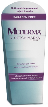
Previous packaging designThe winning design delivers on all levels, with the new structure providing a canvas for much stronger branding. The front panel is a flap that opens to reveal the tube inside and provides valuable space to educate consumers on product benefits. The curved panel shape is a subtle nod to the female silhouette, as women are the primary consumers for the brand. Special attention was given to structure integrity (outer and inner tube), and easy access to the product while protecting secondary packaging from tampering at store.
Graphically, the redesign features easily identifiable branding on front, side and top to capture consumers at every angle. A bright magenta was selected to add vibrancy when placed on lower store shelves and foil board was selected that has a high concentration of white to address recessiveness. The front panel and tube incorporate fading silver graphics to mimic the smoothing product claims. When opened, the front flap reveals the tube inside and highlights before/after photography as well as clinical trial results. It is easily kept closed by a small Velcro disc. Logos on the carton were embossed on top, front and side to add extra dimension, depth and reinforce the premium look and feel.
"We have a fantastic product that was often overlooked on shelf because its aesthetic was so quiet," says Jessica Wright, associate director of OTC Marketing, Merz. "The redesign not only gave Mederma Stretch Marks Therapy a much more premium look, it also works better functionally for the consumer. And the best part—you literally cannot miss it!"
"We're incredibly proud of this work, and feel like it really showcases the power of well executed thinking," says Nunziato. "We're also really proud of our client. It's not always easy to make revolutionary changes like this, but they embraced it, owned it and now they have a breakthrough package on shelf."


