The design director now responsible for both South Korean sister brands Kia and Hyundai, says their vehicles must be differentiated by more than just styling.
Recently promoted from being solely responsible for design at Kia to also assuming control of the styling direction of Hyundai, Peter Schreyer is only two months into his dual role and says he does face a challenge to ensure the two brands have sufficient individuality.
“The challenging thing is to separate the two as much as we can,” said the former Volkswagen and Audi designer.
“That’s not the only thing; we need a strong direction for both.
“Kia and Hyundai are like two young plants that need to be watered and cut once in a while, so both can grow.”

Schreyer said there were already differences between the brands that could be further developed.
“Kia is more the youthful challenger, very fresh, a new brand. Hyundai is more on the elegant side, more on the classic side without the negative connotation. It is the mother company.
“I think it takes time [to establish clear identities]. The difficult thing is that both have a similar product range and both have a short history.
“Give us some time to work on that. I think you can see the difference now. A substance is there on both sides.
“I think it is [important to make them distinctive]… not only different by styling; it needs more than that.”

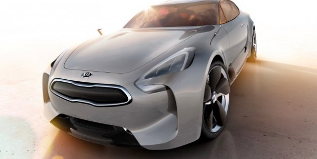
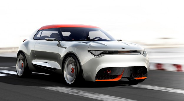
Kia and Hyundai achieve significant economies of scale by sharing vehicle platforms, components, engines and research and development costs. Schreyer, though, believes it’s important for the brands to each feature certain vehicles that aren’t replicated by the other. He pointed to the rear-wheel-drive Kia GT performance car concept (pictured top) as one example. Kia also showcased the Provo concept at this year’s Geneva motor show, a model that could become a challenger to the Mini.

Schreyer said concept cars such as the GT, which he hopes will go into production, had also contributed to the progress of Kia’s brand image and establishing an identity that was publicly recognisable. Asked about his views on Hyundai’s current design language, Schreyer said he was impressed with the company’s ‘fluidic sculpture’ theme but said there was room to improve it.
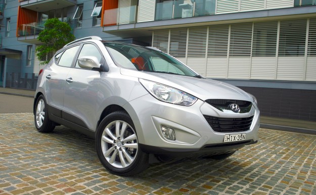
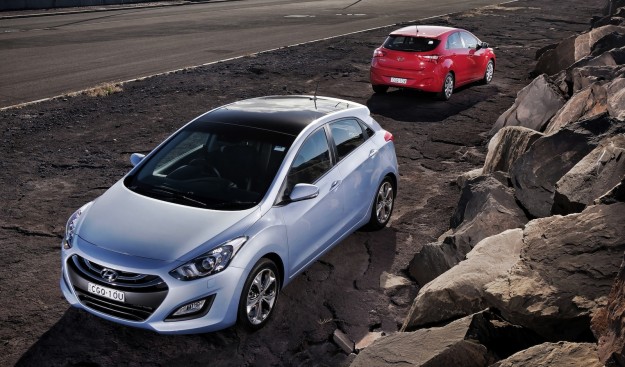
“Hyundai has fluidic sculpture as a description of its design language and I think this is something that can be further developed,” he said.
“What I really like and respect is that Hyundai has been quite daring. It has created its own direction and form language that does not look like it copied someone else.
“The way it has been exaggerated has sometimes been a little over the top.”


