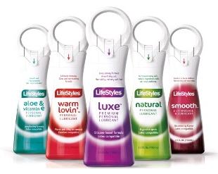
A revolutionary pack design doesn't go unnoticed. The original graphic and structural packaging designed by Reverse Innovation for Ansell Limited's line of personal lubricants has just been awarded three important prizes: the Good Design Award by Chicago Athenaeum Museum (Graphics/Identity/Packaging category); the Brand Identity Grand Prix by TVN Media Group (Pharmaceutical/Healthcare category), and Mediastars by Media Star Editore (Non-Food-Coordinated Series).

Alice Tacconi and Mirco Onesti, partners at Reverse Innovation, said that is the first time the studio has taken part in these competitions and winning the awards represents a highly--gratifying distinction for their work. "We are very proud to have received this recognition for the creativity of our design team. Our agency includes innovation in its own name: these awards give us a huge boost and push us to not only remain at the cutting edge but also to strive for the highest quality in our design work", explained the couple.
The project has restyled both the graphics and structural packaging for the global range of Lifestyles, Manix and Unimil personal lubricant gel brands produced by this multinational company. The new pack design helps the product to stand out, arouses curiosity, conveys a sense of trust and gives free reign to the imagination; all this has been done with a sensitive and sophisticated touch of sensuality.
The structural packaging of this product is so original that a patent registration has been applied for to protect it. "Stability and sensuality" are coupled in the container's highly distinctive shape. The iconic design reinforces the brand's identity and marks a truly innovative development in the visual language of the product category. The unique delivery mechanism is highly ergonomic, allowing instant and easy control over the flow of the gel. The ring on the top which gives the product its distinctive character and outline also functions as a playful handle. And finally, the security seal guarantees the safety of the contents for the customer. The product is available in two sizes: 50ml and 100ml.
The graphic restyling of the new range works so well that the product immediately communicates the main information consumers need. Five carefully--selected colours are used to identify the fragrances. The blushing tonal gradients represent the rising sensation of pleasure. On the shelf, the product's elegant silhouette catches the eye, while the simple but effective style of the graphics inspires a sense of trust. No--one will feel embarrassed picking up the discreet product and putting it in their shopping cart. The pack has been specially created to be perfectly acceptable in public and in all distribution channels.


