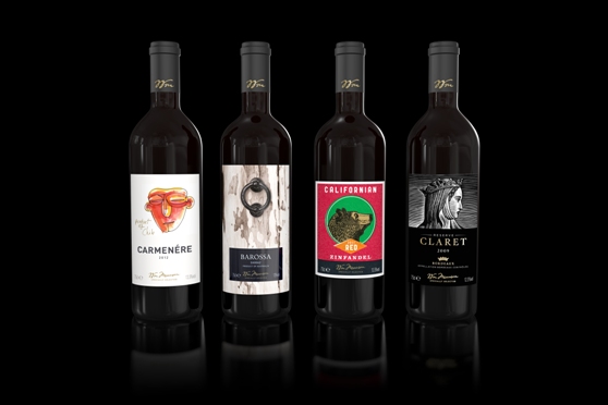
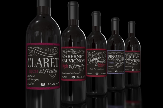
The aim is to make the supermarket a "true wine destination" and every wine brand has been revamped to suit "every occasion and price point". Accessibility was another key requirement.

Elmwood's solution was to create a distinctive labelling concept. For wines by the grape, Elmwood's designers used handcrafted chalkboard typography, engaging customers with familiar visual language. For those by region, bold block colouring and travel stamps were teamed with visually appealing fonts to communicate the flavours.

Martyn Hayes, designer director at Elmwood said: "It was really important to understand the design cues that resonate with customers when buying regional wines, whilst also giving the wines an own-able look and feel. The project was a great opportunity to use an array of illustrators and typographers to bring our ideas to life.
"It was also really interesting researching the wine regions and developing concepts to capture stories that would appeal to everyone from novices to connoisseurs alike."
Claire Williams, head of design at Morrisons said, "The success of this re-launch has been the result of a great collaborative effort, cemented by the fantastic knowledge and expertise of Morrisons' wine buyers. We're thrilled with the way Elmwood's designs not only convey Morrisons' expertise in the wines, but also make shopping for wine easier and more enjoyable for all types of customers."


