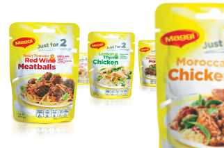
Integrated brand design agency bluemarlin has created mouth-watering packaging for Nestlé's innovative new MAGGI Just for 2 range: delicious recipe bases specifically formulated for two-people. The Just for 2 product range goes on sale across Australia this month.
Smaller households, typically younger consumers without children, present an untouched demographic for the historically family-orientated Maggi brand. Bluemarlin's contemporary graphic design engages Just for 2's new target audience, encouraging them to reappraise the brand.
"Our big idea was: 'delicious dishes; job done!'" explains bluemarlin Sydney associate creative director Polly Williams. "Aspirational food photography presented across two plates and the introduction of a graphic device that talks to the Maggi range, delivers consumer ease, speed and convenience to drive the proposition home."
Bluemarlin updated the Maggi signature yellow pantone with an illuminating white sunburst background. Silver highlights reinforce Just for 2's foil-pouch freshness and contribute to its overall modern aesthetic. Quirky typography adds a sense of colorful informality to on-pack communications, reminding consumers that cooking with Maggi products is easy and fun.


