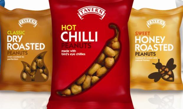
The design agency created the packaging for the brand’s salted peanuts, dry roasted peanuts, honey roasted peanuts and roasted cashews, as well as its newly launched chilli peanuts.
The packaging for each was created using, what the agency describes as, relevant colour cues and bold typography to reflect the flavour, as well as a clear cut out panel to show the product, each in a shape to promote the product inside, for example, a bee for the honey roasted peanuts.
The brand overhaul follows an original brief given to Greenwich Design to design packaging for the new chilli peanut product.
Tavern Snacks managing director Barry Stubbs said: “I asked Greenwich Design to design me a Chilli Peanut pack and they could have just gone away and done that. However, they showed me a vision of something bigger, better and much more exciting. It’s helping me to define a real way forward for the business.”
Tavern Snacks then tasked Greenwich Design to consolidate the brand and pack range identity in order to build a more powerful brand impact at point of sale, appeal to a wider audience and create a more measurable difference to sales.
Greenwich Design managing director Simon Wright said: “Working with small (and local) clients is different from our bigger clients.
“They often need a more strategic plan for the whole brand, which we can support from a design and visual identity perspective. Designing one pack would have been okay – but just okay. However, designing the whole range enables us to tell the whole story.”
The agency is also creating complementary point of sale and advertising activity and is now working on the crisp range and pork scratching ranges which will be launched next year.


