This started as a blog post about creative exhibit design, but turned into a post about creative exhibit designers, because without the designers, you don’t get the creative design. It’s that simple.

Creative exhibit designers are skilled at solving the many problems that arise when you build a shippable, temporary structure in order to attract, host, and convince a group of buyers walking a crowded trade show floor.
But what actually makes them creative?
Joshua Spodek writes that creativity is usually not caused by the stereotypical flash of genius, but is simply problem solving by an experienced expert, whose hidden steps of creation are repeatable, even though they seem inspired when witnessed by an outside observer. (See more of Joshua’s insightful thoughts on creativity here.)
So to become a “creative” exhibit designer, your exhibit designer needs knowledge gained from experience. Let’s look at the knowledge that is needed in 7 areas to create trade show exhibits that will break through the trade show clutter, connect with your target audience, and drive business results. These 7 areas are:
1. Know your end-user customer

enduserBecause ultimately the main exhibiting goal is to advance the sales process, then the most creative booths create more sales opportunities. That usually means forging a stronger connection with the buyer, which depends on a deeper understanding of the buyer. So your designer needs to know what your buyers want most, what their hopes and dreams are, their fears, their language, their demographics, and more. Are they aggressive or skittish? Do they love innovation or avoid risk? Are they independent or team players? From the seeds of customer knowledge grow some of the most fruitful exhibit designs.
2. Know your company

knowyourcompanyYour exhibit designer must be a detective, and ask lots of questions to understand your company. Questions like, what are your goals at trade shows? How has your brand evolved, and especially in how it has been presented at trade shows? What are the marketing messages and programs you are sharing in mediums outside of trade shows? What are the main products your company sells? What makes your products and services better than alternatives? And does that matter much to your customers? What does your company stand for? Is your company a risk taker or do they play it safe? While asking these questions, a creative exhibit designer will look for clues about the genuine advantages your company offers that can become a key part of your exhibit design.
3. Know your competitors

knowcompetitorsAt minimum, your designer needs to know how your competitors stack up against your own company’s offerings, and how you will be compared to them in the minds of your booth visitors. Even better, know what your main competitors are doing at trade shows – their exhibits, activities, and show schedules. Share with your exhibit designer if your competitors are better positioned than you are to win the attention – and business – of attendees who visit both your booth and theirs. For example, some shows are filled with hanging signs, some with double decks, while others have barely any of either – what will your main competitors be doing? You don’t want to be the only one to bring a knife to a gun fight.
4. Know your industry

knowindustryKnowing the context of your industry gives designers a better chance to succeed. So let them know, or give them time to research. What are the trends affecting your industry, in terms of growth, innovation, technology, legal issues, consolidation and mergers? Is there an unwritten, but commonly followed way of doing business at trade shows that is different than other industries? Does your industry have lots and lots of rookie buyers coming through every year, or are there small group of veteran buyers that wield disproportionate power? Do interactions with attendees usually take 5 to 10 minutes, or more like 30 to 60 minutes? Are booth staffers expected to be dressed formally, casual, or in between?
For example, a designer may do research and discover there are very common colors used in your industry on trade show exhibit graphics. This happens because buyers at one show tend to the same demographic, and other designers invariable choose the same prominent color scheme that is known to appeal to that demographic. To stand out, a designer who knows that certain colors will be overused can instead select other colors that also appeal to your target market. This is a repeatable process borne from hard work and experience, not a flash of genius.
5. Know marketing & branding

marketingstrategyExhibits aren’t furniture, they are marketing tools built to achieve your specific marketing goals (be it build brand awareness, generate sales leads, strengthen relationships, launch new products, or something else). Creative exhibit designers need to understand the implications of your brand positioning, promise, and personality. They need to know the various market segments your exhibit will be shown to, and how your marketing messages change for each. They need to know what kinds of words will get the most attention from buyers. And they need to know how other marketing mediums work in tandem with trade shows, such as social media, digital and email marketing, and print.
6. Know trade shows
know-tradeshowsAs we just said, it’s good for exhibit designers to know marketing beyond trade shows. Yet it’s essential that they understand what makes trade shows unique. Trade shows exhibits are not brochures, nor websites, nor magazine ads, and so the amount of information on a trade show display is best kept to fewer, yet larger elements. Trade show exhibits provide a welcome for attendees, a workspace for booth staffers, and a stage for products. A creative exhibit designer understands the scale of images that will be needed to get attention of attendees walking down a trade show aisle. Good designers also understand that you will only be successful if you can generate a profitable ROI, so they design your exhibit while also considering the high costs of exhibit shipping, drayage, I&D, and refurbishing.
7. Know design
know-designNotice that this list finishes, rather than starts, with design. Without understanding the first 6 points, a designer may create a cool looking structure, but utterly fail to drive business results with your trade show display. True designers do their homework about your customers, company, competitors, and industry. Then they apply their design and marketing skills to create a space that facilitates successful attendee/exhibitor interactions in your booth. Creative exhibit designers work with the booth space and budget you have to create to create visual intrigue and marketing clarity. They know how to combine images and text around a three-dimensional object. They are great with architecture, space, ergonomics, color, typography, imagery, order of information, and more.
“If it doesn’t sell, it isn’t creative.”
Ultimately, the problem to solve is to drive business results – awareness, leads, sales, relationships – so the exhibit pays for itself. As legendary ad man David Ogilvy said, “If it doesn’t sell, it isn’t creative.”
And creativity doesn’t have to come in a flash. More likely it comes through an iterative process of discovery, research, brainstorming, rough design, initial feedback, and then final design. An ongoing dialog will uncover layers of insights that rarely show up after reading an RFP. And the creative is only as good as much as the exhibitor is willing to support and engage in the design process. This is why blind RFPs all but guarantee you will receive sub-par creative submissions from bidders.
Here are several examples of creative exhibit design to help inspire you:
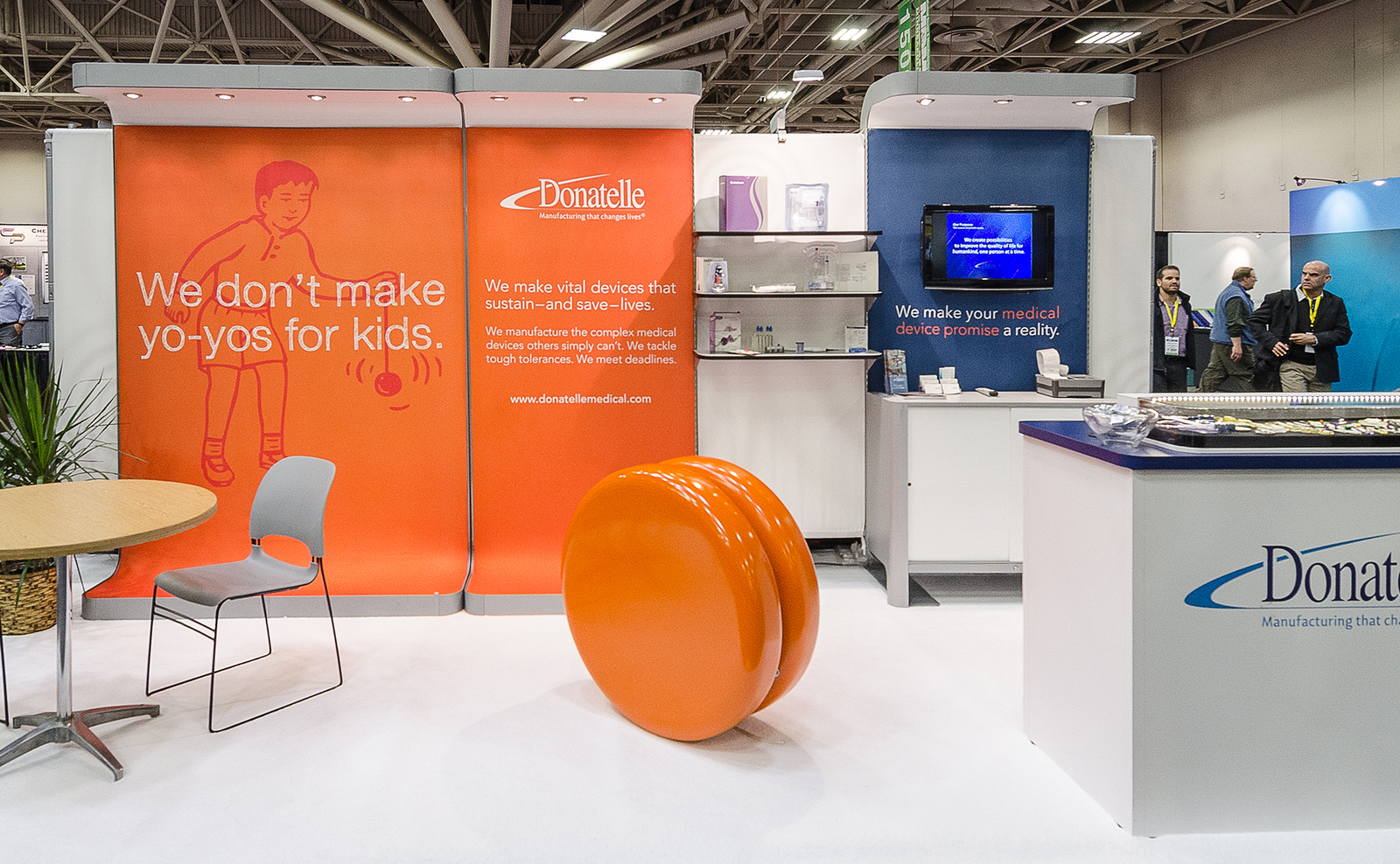
Donatelle: This medical device manufacturer tackles brand confusion head-on with a colorful, playful exhibit that includes a gigantic orange yo-yo, sure to make the most jaded trade show attendee slow down long enough for a booth staffer to engage them.
donatelle
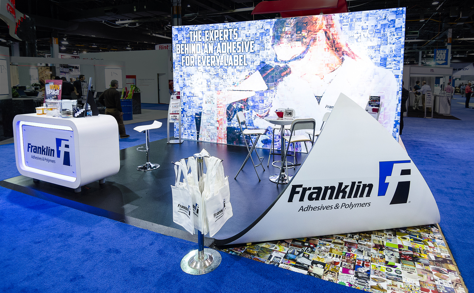
Franklin: This creative exhibit pulls up a corner of the booth’s flooring to reveal the company logo and product offering in an eye-catching way. The pulled back floor is explained by the message on the back wall: “The experts behind an adhesive for every label.”
franklin
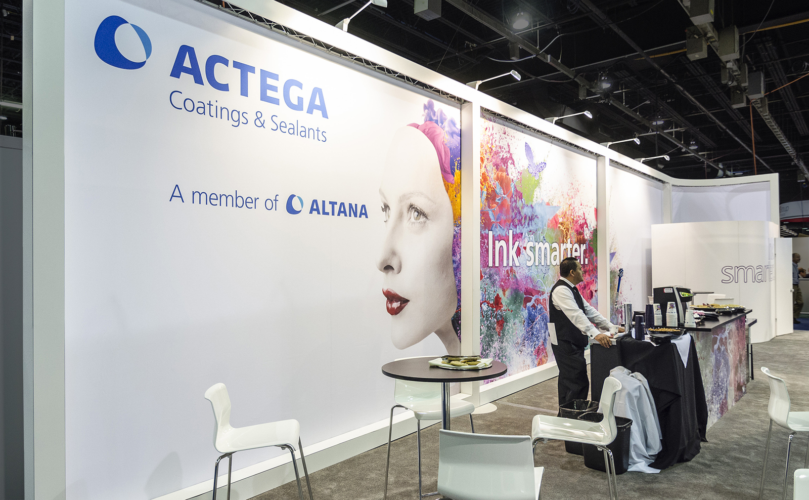
Actega: This exhibit solves many problems creatively. It creates a bold, clean presence with minimal footprint, leaving room for interactions and hospitality. The colorful central image and blue corporate logo stand out against the minimalistic white back wall. And the center panel has a clever, memorable tagline, “Ink smarter” which plays on the expected “think smarter.”
actega
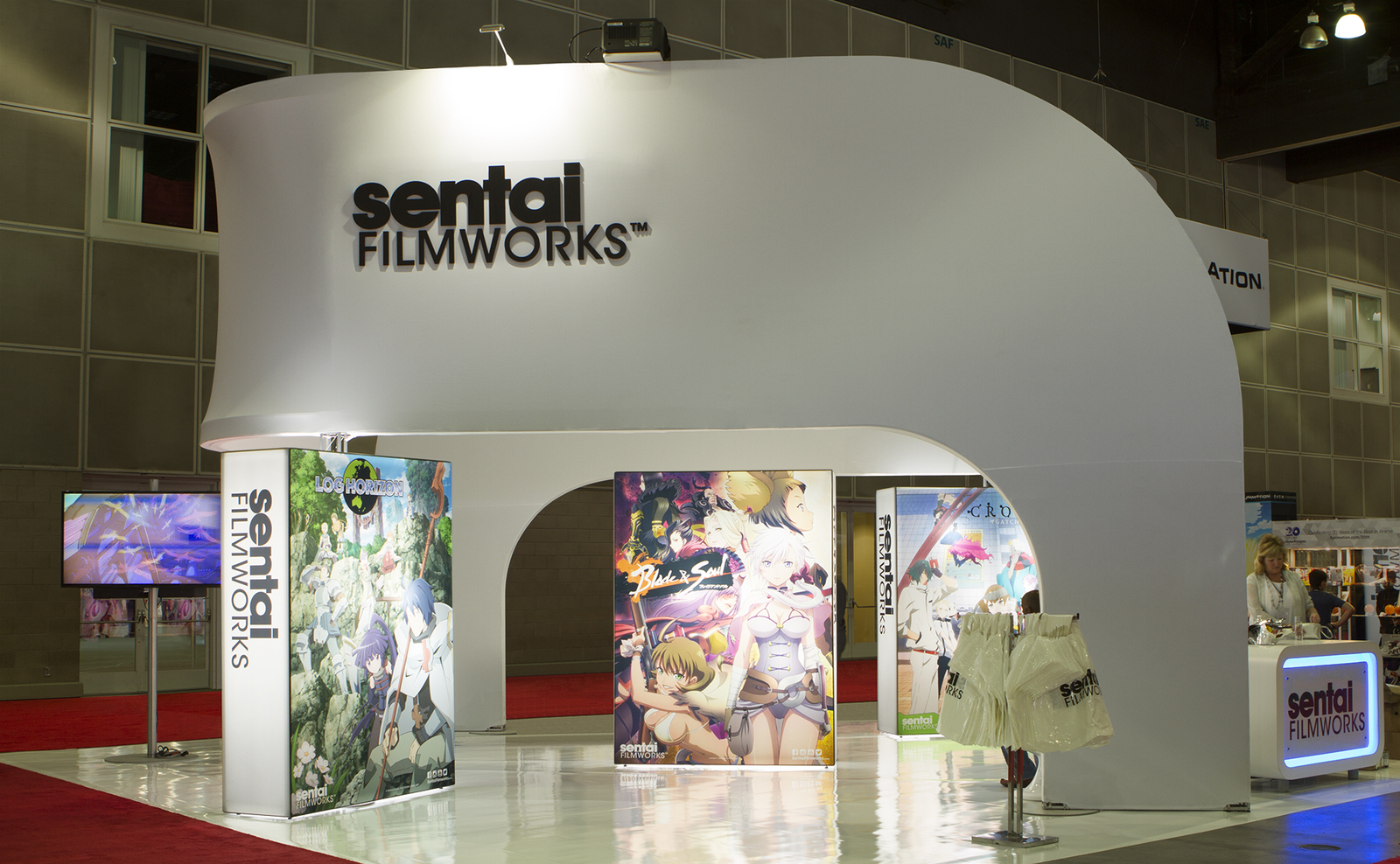
sentai FILMWORKS: This exhibit balances the need to create an impressive overall company brand with the need to promote popular products. The large white structure gives ample space dedicated to promoting the parent brand, while colorful backlit illustrations showcase their most popular and newest products.
sentai
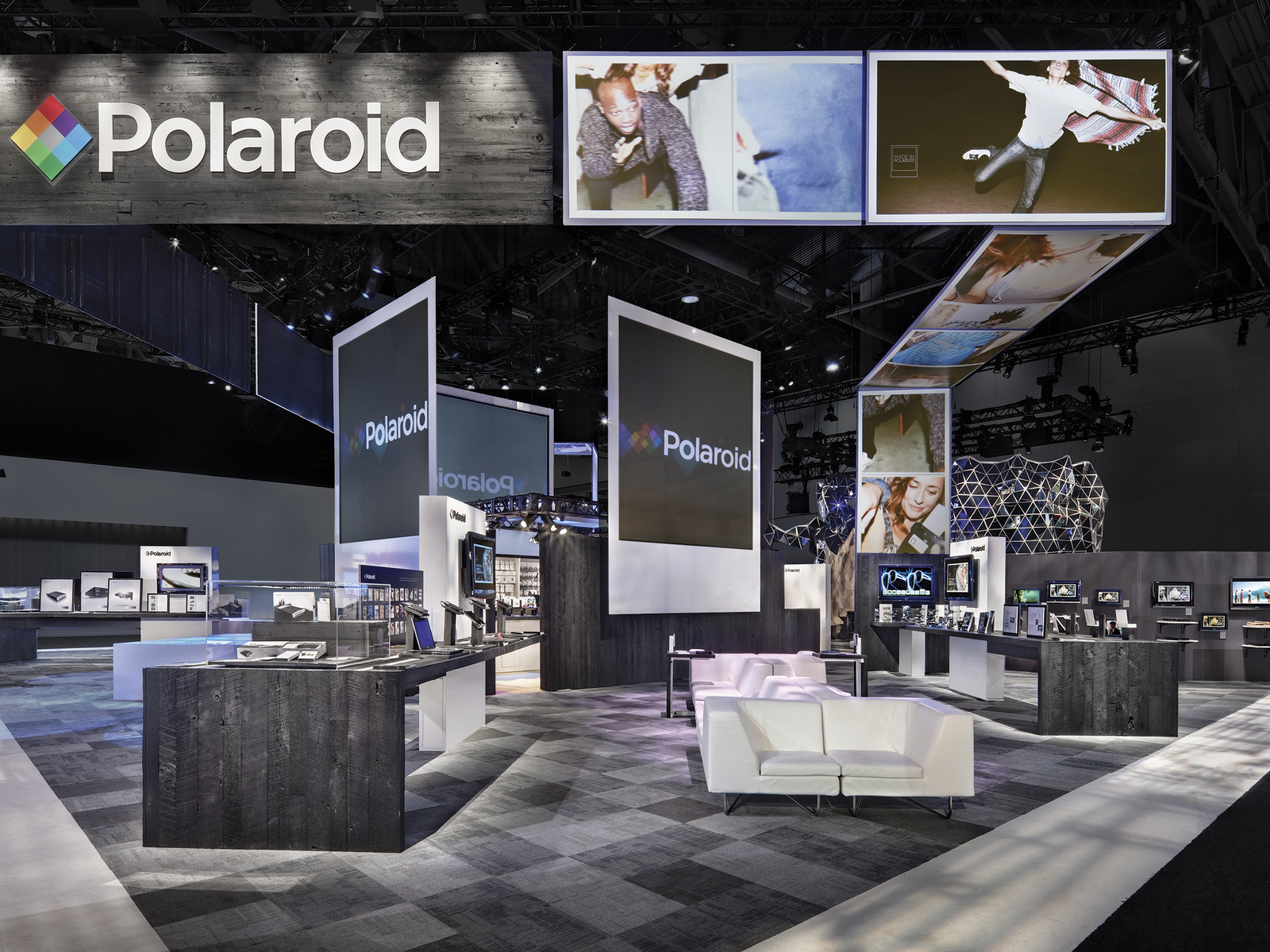
Polaroid: This exhibit turns the company’s iconic instant film shape into large projection screens for showing images that portray the evolutionary shift of their product offering and brand positioning.
polaroid
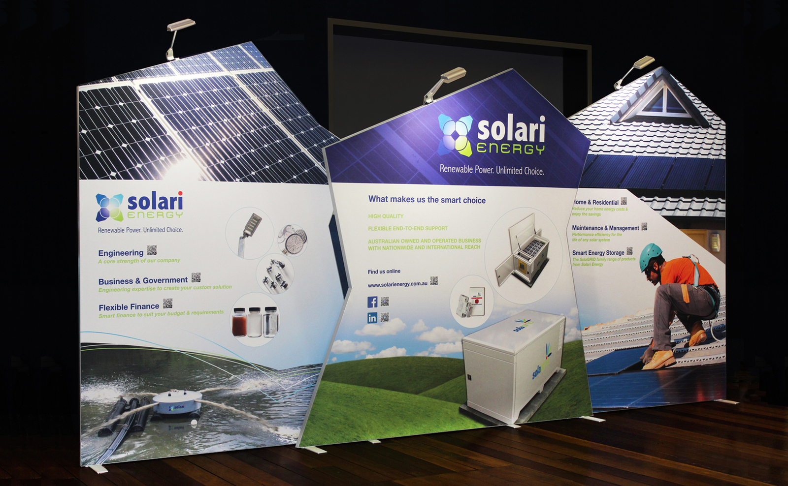
solari ENERGY: This exhibit combines shape and images to create a visually compelling look that catches the eye. The three back wall shapes can be combined in various combinations to fill 10 foot or 20 foot booth spaces.
solari
Eurocopter: This exhibit takes full advantage of the exhibit space, wrapping the products with fluid, monumental shapes that echo the company’s helicopter products and their brand look. These single-piece structures are high above the product, then down to the floor to create separation between meeting spaces, and then up high again to frame other meeting areas and highlight the company logo. Messaging is clear, bold, and on-brand.


