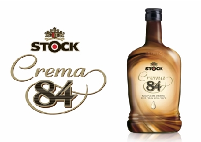
According to Minale Tattersfield, the design is based on a series of semi-translucent 'swirl' motifs, one of which envelops the existing Stock 84 identity to recall the liqueur's famous heritage. A full shrink-wrapped label was applied to "accentuate the smooth textured look of the bottle".
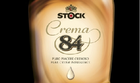
"Existing visual language of Stock 84 was regarded as rather masculine and austere, so it was important that we created a softer, more sensuous positioning to connect with Crema 84's wider target audience", said Robert Mardin, communications spokesperson at Minale Tattersfield.
Source:
http://www.packagingnews.co.uk/markets/minale-tattersfield-creates-branding-for-new-liqueur/


