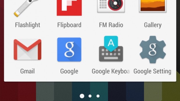
Google has updated its Android Search app to add an extra hint of Android 5.0 Lollipop style for those who use the Google Now Launcher.
It's a frustrating fact that most of us using Android phones - even brand new ones - haven't received our Android 5.0 Lollipop updates yet. Even worse, when we do get it, the manufacturers may not even take full advantage of Google's beautiful Material Design.
You've been able to get a somewhat more stock Android experience on your phone for some time now thanks to the Google Now Launcher app, which tweaks the look and feel of your homescreen to be closer to what Google intended.
Now Google has launched a quiet update that adds more of a Lollipop feel to proceedings.
The update seems to have come via an update to the core Google search app. Once installed, those running the Google Now Launcher will notice that the Google search bar and the app tray have a Lollipop-like pure white look.
You'll also note that the Google Now screen itself, accessed by swiping to the left, has a fresher Android 5.0 look to it.
Read More: Best Android Launcher
All in all, it's the same basic look as those who run the Google Now Launcher app on Android 5.0 Lollipop were getting. Prior to this, as Android Central points out, the app would adapt its look to the specific version of Android that was running on your phone.
It's still not the full Android 5.0 Lollipop update, but Google is clearly doing its best to lessen the pain of waiting.


