ToyNews speaks to Hasbro's designers to find out how Furby was made fit for the modern age.
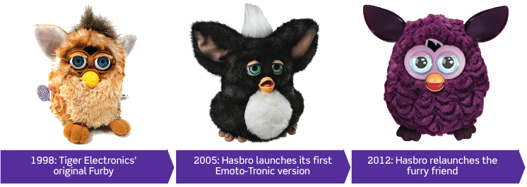
The original Furby was an instant phenomenon when it hit shelves in 1998. The furry, Furbish-speaking animatronic pet from Tiger Electronics went on to sell in excess of 40 million units around the world.

To say Hasbro had ‘a bit of a job’ in re-creating the craze with another version would be a huge understatement.
The firm brought out an ‘Emoto-tronic’ Furby in 2005, but this time around it was arguably the real comeback.
‘Furby 2.0’ – as some initially called him – stepped into the modern world with new electronic features and a corresponding (and on-trend) iPhone and iPad app.
Was Furby 2012 a toy for our times? One thing is certain: no one can accuse Hasbro of not bringing a feature-packed Furby to the table, an electronic pet that could resonate with the kids of today. And the fact it all but sold out everywhere would seem to indicate the pet is serious hot property. See below to find out how Hasbro did it.
The new Furby was first revealed to the UK public on Facebook earlier this year, when Hasbro asked, ‘Guess who’s coming back?’
It wasn’t long before news of Furby’s return began to spread on social media platforms, as Furby owners of old got nostalgic at the sight of this old friend, more reminiscent of the original than the 2005 version, with the addition of LED eyes.
Foye Pascoe, Hasbro’s general manager for UK, Ireland and Nordics, says: “This year Furby has been welcomed back with open arms – the reception from consumers has been phenomenal. Furby has once again delighted children and fans of all ages across the nation.
“The campaign to bring Furby back into the spotlight has included a partnership with girl band Stooshe, which focused around a comprehensive PR and media campaign; and a special outreach programme with Stardoll Media – the online fashion community for girls. Other Q3 and Q4 activities have included social media and community engagement on Facebook and Twitter, as well as creating celebrity look-a-likes, including Alan Carr.”
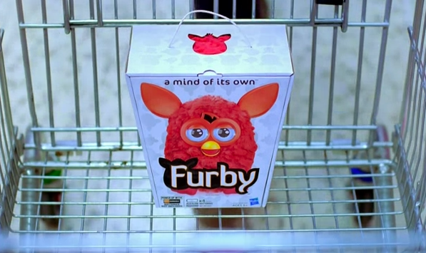
Additional exposure to Hasbro’s target girls’ audience was achieved with a key advertising slot during ITV’s mega popular talent show The X Factor, while Furby also targeted parents in retail Christmas adverts, including a starring role in one of Tesco’s festive promotions (below).

With Furby’s inclusion in 2012’s ‘Dream Thirteen’ at Dream Toys, the hype had well and truly been generated.
Fast forward to Christmas and Furby had all but sold out at most of the UK’s major toy retailers, while its value on some online marketplaces soared above £100: Proof that the third version of Furby is a bona fide blockbuster toy.

1. Shaping up
Sillouhette, logo, branding - How was Furby designed?
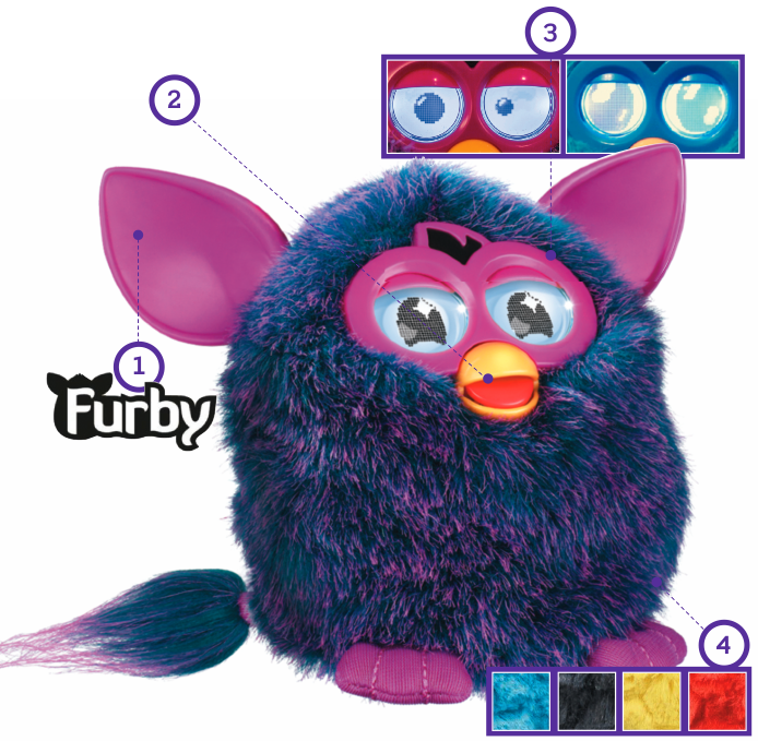
“The icon came about early in our development process,” adds the Furby designers. “We wanted Furby to be easy to draw for kids as well as recognisable in many forms for branding purposes. As we sketched out how we wanted Furby to look in 3D, we discovered that we were always hitting the same basic shape: a coconut with ears. We added rubber to the ears to give Furby a modern tech/device look and feel.”
2. Look who's talking
How was the Furbish language play element developed?
“The language was already developed by the original inventor. It’s actually a mix of lots of different languages,” say the Furby designers. “We made a few adjustments on the way, for instance creating new Furbish words for new or slang phrases.”
Mechanically, this Furby is way beyond the original Furby and, amazingly, still only has one motor driving everything.
3. Eyes to see you
What advantages did Furby's new LCD eyes bring?
1. “To create the most expressive toy ever. The LCD screens enabled us to make Furby communicate visually what it was thinking.”
2. “To communicate the different personalities.”
3. “To deliver magic in as many ways as possible; these eyes elevated it to a new interactive level.”
4. “The digital eyes and the plush creature really drive the idea home that Furby is a hybrid of organic creature and digital device. The big challenge was getting the mechanical eye-lids to move over the top of the LCD screens… it didn’t feel like Furby until it had eye-lids.”
4. Colourful character
What was the idea behind the bright colourways and different fur textures?
“There are lots of animatronic plush toys/brands out there, taking their inspiration from nature, to look as realistic as possible,” say the Furby designers. “We instead decided to look at fashion, furniture and interior design trends and picked up on the neons and highly saturated RGB colours we saw in youth culture, where it was all about being bold and standing out.
“During our material exploration we discovered the process of texturing plush and it all made sense. We wanted every Furby to have unique individual qualities so the combination of bold colour and unique texture really worked for us.”
5. Making Furby 'Appy
The Furby designers always planned for Furby to connect with the digital world.
”We focused on mobile devices – most kids use them now and we had the right technology that would enable us to do a lot of fun things. We knew the big play patterns with Furby were nurturing, personality and language, so we allowed kids to feed Furby to see how it reacts depending on what personality it is in, and we added a translator so kids can learn the language.”
The evolution of furby


