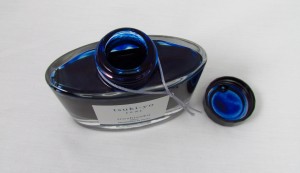
On the inside glass walls of the bottle, and the cap as well, you can see the vibrant blue shade of this ink from Namiki, which is called Tsuki-Yo and has what I would consider a mostly blue-black ink feel to it, but with a very slight hint of green that lightens it up just a bit. The thing I really like about that little difference is that many blue black inks that are used with a fine or extra fine nib tend to look so dark that they look black, but even with an extra fine nib you can still pick up the blue and slight bit of green in the lines that this ink lays down. Additionally, the ink does show a bit of shading, which again is impressive when you consider that I have exclusively used it in a pen with an extra fine nib.

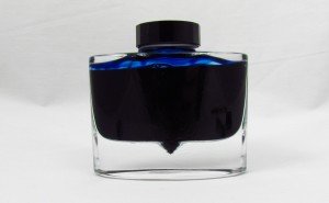
One cool thing to note about the bottle is easily seen in this rear shot above. At the base you can see that there is a pointed drop below the rest of the ink, which is there so you can get the nib all the way into the bottle so that when the ink is almost gone, you can still get as much out as possible.

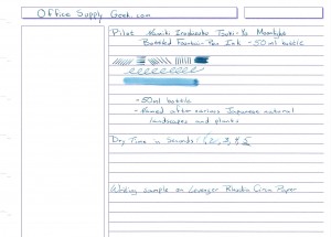
The writing sample above shows some of the great (but subtle enough for business purposes) color and tone that separate this ink from other blue black inks. You can also see that it behaves pretty nicely on this Levenger Rhodia paper, as it does not feather and it didn't show through the backside at all. The dry time is a shade on the long side at about 5 seconds, but that has more to do with the paper, as when I tried it on more standard paper, it dried within about 2 seconds. One thing I'd like to do with this ink is put it in a pen with a broad or italic nib to get a better look at the shading, so maybe once I do that I will revisit this review with an updated writing sample. Until then though, I would definitely recommend picking up some Pilot Namiki Iroshizuku Tsuki-Yo Moonlight Fountain Pen Ink (wow, thats a mouthful) even though it is a bit more of a premium and pricy ink, I think it is well worth it.


