I’ve had this ink for a while now, and with all of last week’s reviews on beginner fountain pens, I feel like I’ve been in a little bit of fountain pen review mode so after todays Noodler’s Fountain Pen Ink review, Im going to give it a rest for a little bit and review some other office supplies. I actually commented about this ink back when I did my first fountain pen review on the site, which was for my Lamy Studio with the EF nib.

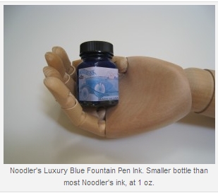
I always like to show a picture of fountain pen ink with the cap removed because I think that seeing the ink on the inside walls of the glass bottle and on the inside of the lid give some indication to the color, and viscosity of the ink itself….I dont know, I think I was just looking for an excuse to use the word viscosity. Anyway, as you can see this ink has kind of a vibrant or almost neon color to it when still in the bottle, some quick facts about this ink:
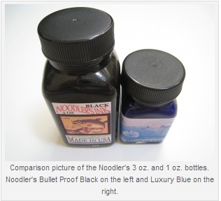
Currently comes in a 1 oz. bottle
Can be found at most fountain pen retailers for about $13.50 per bottle
Uses Noodler’s “Bullet Proof” technology to prevent fraud and resist the effects of bleach, light, and water.

The writing sample for this ink was done in my Clairefontaine notebook which I reviewed recently. This ink and paper work very nicely together, as there is no feathering or bleedthrough experienced. The blue color of this ink is very crisp and clear on the Clairefontaine paper, which to date has been great with any ink and fountain pen combination I have tried on it. I was also impressed by the pquick drying time with this ink. In previous tests it seemd that most inks took a bit longer to dry on the Clairefontaine paper, but this one was pretty much dry after 3 seconds. If you are looking for a quick drying ink that is also fraud resistant and not black, then the Noodler’s Luxury Blue is a great choice. This color is not my personal preference for a blue, as I usually like a darker blue, or a blue black, but removing my personal opinion, I think it still looks great and lays down a very nice line.
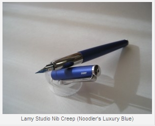
Its always fun to see the artwork on the Noodler’s ink bottles, so I thought Id include a quick picture of part of the label above. One thing that I am not particularly fond of with this ink is the amount of nib creep that I have experienced with it. Admittedly I have only used it with my Lamy Studio and Pelikan M215, but considering that those are two of my most often used pens, it does impact my likelihood to continue using the ink. Im sure that there are some other pens and nib sizes that this ink would work much better with, and quite frankly, the nib creep does not stop the pen from actually writing nicely, it just is more of a visual thing to me that I dont like how it looks.

i will also be creating a new page for my Ink Comparison Log section of the site to include the Noodler’s Luxury Blue, and some other blue inks in the next few days, so keep an eye out for that. I am only doing the ink comparison logs using Levenger paper to try and maintain some consistency of the testing, so if you want to see this ink on Levenger paper, that will be coming up soon. I’ve got a few other ideas I am trying to get up and running on the site to hopefully make it a little more informative, so thanks to all of you who are visiting, and I hope to see you all back here in the future.
Update: There was a question in my comments section asking what exactly “nib creep” is, so I thought it would be best to link to a photo of it since they always say a picture is worth 1000 words. Keep in mind that for the most part, this does not make a pen write any better/worse, it is more of an aesthetic thing, and occasionally can be a neatness thing if you are worried about even a small amount of ink getting on something. Below is the picture from my Lamy Studio review where I experienced a good deal of nib creep with this ink.


