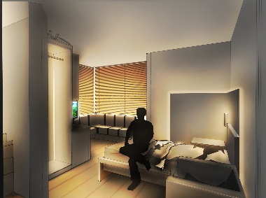
Homely Paul Traynor's lighting scheme for the residential quarters at Old See House seeks to create an uninstitutional, comfortable ambience
Of all the projects that cross the desk of a top lighting designer, working on a brief for a psychiatric unit probably couldn't be described as the most glamorous commission. Yet, for Paul Traynor of Light Bureau, Old See House, a project in the mental health estates of Belfast, has become one of the most challenging and rewarding endeavours he has ever been involved with.
Legislative constraints
Far from being content with the oppressive spaces we associate with mental illness, courtesy of films like One Flew Over The Cuckoo's Nest, many institutions are striving to create a space which works as therapeutically and comfortably as possible within the confines of function and legislation.
Old See House, importantly, is separated into a clinic and residential section. "That's the whole idea: residential facilities should feel as comfortable and like a domestic environment as you can manage," Traynor explains.
Obstacles quickly emerge. While mental health facilities have evolved to the point where they are much further removed from prisons in terms of design than they used to be, the legislation on lighting has not changed so rapidly.
"The fittings [typically] specified for mental health facilities are pretty much the same as fittings designed for prisons," Traynor reveals, painting a picture of the difficulty of marrying function and comfort. "Unfortunately, because of legislation regarding personal safety and anti-ligature, you end up with a set of fittings that are completely inappropriate for the purposes of the facility."
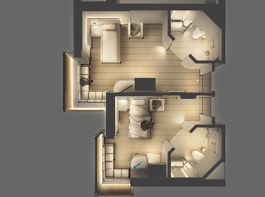
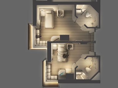
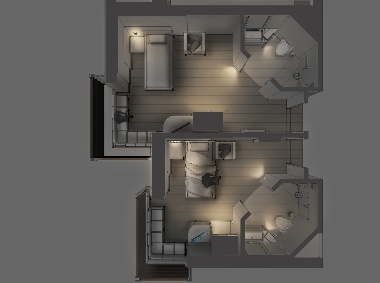
Phased modulations Light Bureau's renderings of typical phased scenes forlighting the residential accommodation at Old See House
The original specifiers for Old See House had created a scheme in accordance with the legislation but with little consideration given to comfort or aesthetic design, promoting safety and healing, or rebuilding confidence. This, Traynor felt, was a gross oversight. "We thought it was crying out for help from a good lighting designer," he says.
The project relied heavily on academic research to support the principles of the design.
"We know that some things are very disturbing to mental health patients: one of them is glare," Traynor explains. "Glare, contrast and flicker are particularly annoying to hypersensitive people. With that in mind, you wouldn't think that the control gear used in these fittings would be magnetic, but a facility I saw about three years ago was doing exactly that – creating a level of flicker that could be distressing to patients."
Comfort was the next step for Traynor. "We looked at fittings that were nice … we wanted something that was a good colour temperature to give a nice, warm domestic feel. Everything was aimed at 2,700K to 3,000K wavelength. We had to make sure luminance levels were met where they were needed."
It was important to create a lighting solution that did not rely solely on downlighting, but used different sources to create a more organic and comfortable space.
"We wanted to bring fittings down to head or floor height, which makes for a much more comfortable and convivial environment. But that brought with it issues surrounding personal safety anti-ligature measures."
Safety issues
The real challenge, then, became integrating the lighting while abiding by safety legislation.
"We set about, I think, fairly innovatively, incorporating lighting within the interiors and the joining," Traynor explains. "For example, we designed a table lamp that was actually a floor-recessed uplight with an LED light engine, completely flush fitting, extra-low voltage – obviously – and unbreakable. We turned it into a table lamp by sitting a polycarbonate object over the top of it which would glow and give the light the feeling of a table light. If somebody were to take it off or try to hurt themselves with it, it's not breakable; so there's no electrical safety issue and no issue over sharp edges."
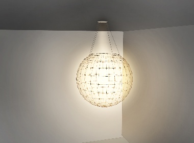
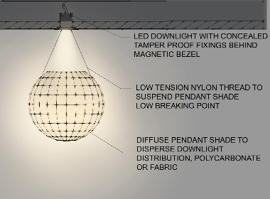
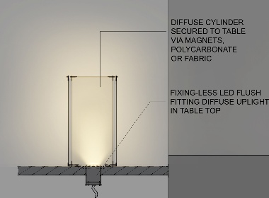
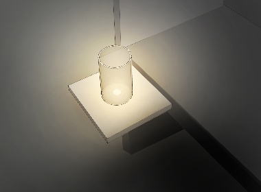
Safety first Bedroom pendant and wall fittings for the Old See House scheme were specified with prevention of self-harm in mind
Close consideration was given to subtle nuances of lighting, its effect on self-esteem, for example.
"We looked at some LED downlights that incorporated a magnetic bezel that pops over the top. If you took the metal ring off you would see anti-tamper fittings, but they're not immediately visible. So by using these you're not telling patients they can't be trusted by themselves, you're treating them as adults and civilised human beings, which is really important for their self-esteem."
The same philosophy was applied to the design of the bathrooms. Traynor explains: "In the bathrooms we produced light for vanity, which hopefully will make the user feel as good about themselves as possible when they look in the mirror – reducing the shadow – but we didn't double up on light sources in the bathrooms, it was quite a sparing sort of scheme."
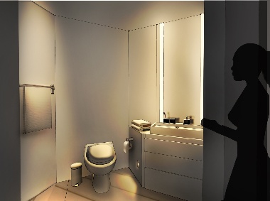
Feel-good lighting Integrated vanity mirror fittings in the bathrooms reduce shadow on the viewer and help promote self-esteem
Budget considerations
The bathroom scheme, and even simpler bedroom scheme, was also in tune with the cost issues which beset the project.
"These are publicly funded psychiatric units," Traynor explains. "You have to resist the temptation to go too far. It's not a super high-end residential property for a rich client and it's not a five star hotel. There are some things that you just can't do because there is a budget and because this is being funded by the health estate."
Despite the early stage of development of the scheme, Light Bureau has already been approached regarding another psychiatric unit, also in Belfast. While LED light sources dominated the Old See House project, fluorescents were used for some task lighting. Traynor suggests that, for the next project, solid state will play a more central role.
He also reflects that the project opens new avenues of lighting to the designer's consideration.
"I really do feel that, for anyone who is interested in the creative integration of lighting in our surroundings, these are brilliant projects to get involved with," he says.


