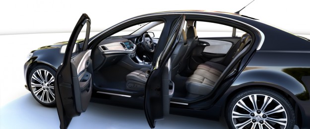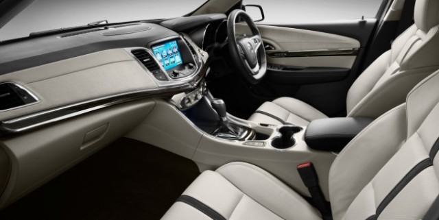
In the Holden VF Commodore cabin there are just two parts leftover from its Commodore predecessor – the centre console lid and the rear air vents. Everything else is all-new, with Holden designers using “sophisticated” and “rich” buzz words to describe the overhauled design.
“We really wanted to maintain that horizontal, wide, sporty feel,” tells Holden design manager, John Field.
“The price of place in the centre stack is the eight-inch colour touchscreen, and while it’s in easy reach of both occupants, it’s buried into the instrument panel to minimise glare and reflection.”
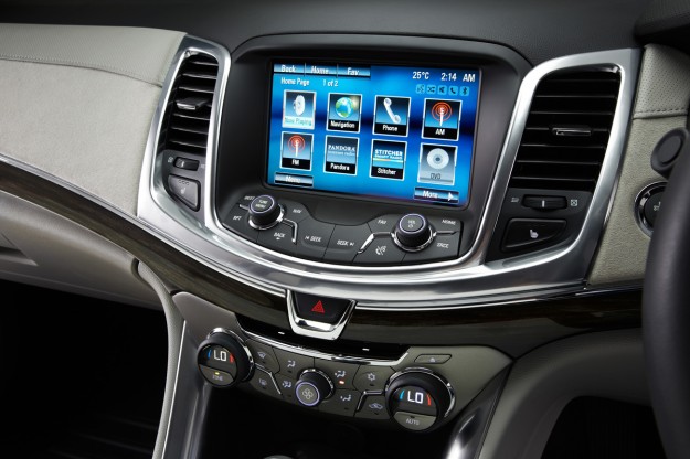
Field explains that by putting the switches underneath the touchscreen on an angle it takes up less vertical space on the dashboard, and “also keeps the instrument panel very slim and low profile.”
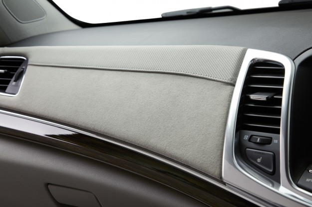
Although all the buttons are illuminated soft white, and there are ice-blue LED detailing, the plastics quality isn’t perfectly matched. On the Calais V show car, alcantara covers the middle area of the dashboard and door inserts, but the soft-touch door trim meld into a hard, textured upper dash surface that feels less than premium.
“Really we were focusing very intently on the customer focus zones, so the touch zones and the visual zones,” says Field. “We put all the attention through … the door trims where the customer can actually touch it.
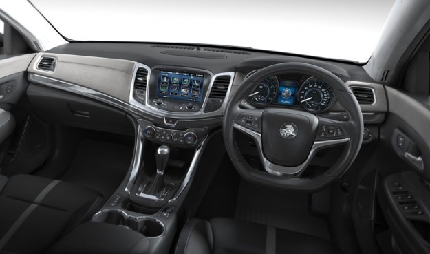
“[The dash top] being hard plastic is really a more functional area, it’s not something the customers are really attuned to, we don’t think they’re going to be offended by it or upset. It has a nice, low-gloss, soft-touch finish, so it shouldn’t be a real issue for us.
“[Cost is] always a consideration of course, but from the customer point of view it’s not something they’re really that focused on.”
Although Holden wanted to lift plastics quality, focus was also on improving ergonomics compared with the outgoing VE, particularly in the area of heating, ventilation and air conditioning (HVAC) controls.
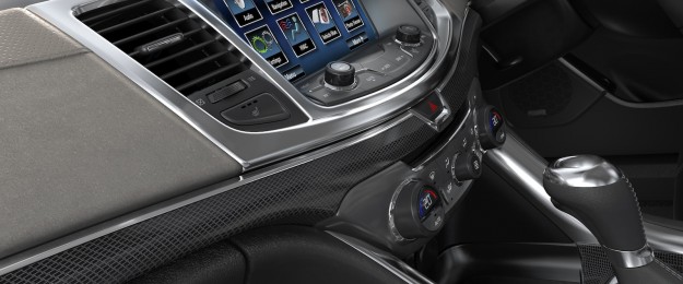
With the VE, users need to canvas the digital display shared with the audio controls to see what the settings were. With VF, Holden moved the climate control temperature readout inside each of the rotary switches – one on the left for passenger temperature, and on the right for driver.
“This is really based on customer feedback and ‘best ergonomic practice’ … to put the readout where the control is,” says interior design manager Joe Rudolph.
“As well as that, there are now LED indicators in each of the [directional ventilation] buttons, so that you know instantly the state that the HVAC system is in, and that’s [also] come from global ergonomics best practice and customer feedback both locally and globally.”
Previously, the VE had an up/down toggle to scroll between the different directions of air flow. The VF has four buttons each surrounding the central fan control, for face-level, face- and feet-level, feet-level and demist and feet-level.
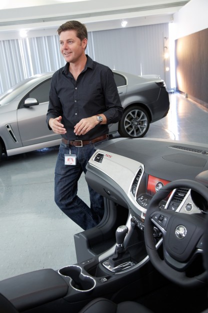
Adds design director Andrew Smith (above): “what it means is that you don’t rely on the display, you can rely soley on this [the dial] and know where you are. That’s been one of the complaints that we’ve had not just in Australia but globally … people actually getting lost with HVAC.”
Of the HVAC location, John Field (below) says that “the HVAC controls are visually separated to minimise confusion between the two controls [HVAC and audio], and the centre stack is very fast and laid over to achieve a bit of speed just like they do on the exterior.

“With the instrument panel actually floating over that feature, almost like a shingled roof tile. Apart from giving it a nice, floating, lightweight appearance, it’s also one of those qualities that … desensitises the interface between these upper [audio/nav] and lower [climate control] instrument panel components. So it really was a win-win there.”
Other changes compared with VE include a smaller-diameter steering wheel – down 7mm to 370mm – following “feedback that the current [steering] wheel is a little on the large side” according to Field, while electric-adjustment of steering height and tilt was not considered necessary – “I wouldn’t say it was seriously looked at for this project. Perhaps in this market it’s not such a customer want.”
The steering wheel hub looks like that of the Cruze but is actually its own part, but the cruise control and audio control switches are, however, shared. The new transmission shifter is “similar to lots of other forthcoming products coming into our showrooms”.
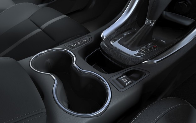
Traditional Commodore identifiers have been flicked – the bootlid button has for the first time in generations been moved from the glovebox to the driver’s door; the front-side air vents move onto the dash from the driver’s door for the first time since the 1993 VR; and the power window switches have relocated from the centre console to the door trims for the first time ever.
“The relocation of the [power window] switches has opened up a lot of space to put some very useful cupholders,” explained interior design manager Joe Rudolph. “Also we’ve been able to locate storage both behind and in front of the shifter, and that’s really in response to customer feedback as to what they would like from their console…
Apparently, it was fleet buyers who dictated the need to have a bootlid button in the glovebox for security reasons, and Holden no longer thought that approach was valid with the VF. The relocation of the air vents to the dash is a “more efficient way of doing things” according to Rudolph.
Finally, perhaps the biggest complaint about the VE Commodore has been attended to, but not completely altered – the thickness of the A-pillars which reduce driver vision around corners.
“The A-pillar trims themselves are new, and we did in fact manage to shave a few millimeters [4mm], as much as possible, off the front…” tells John Field.
“It’s a small improvement.”
