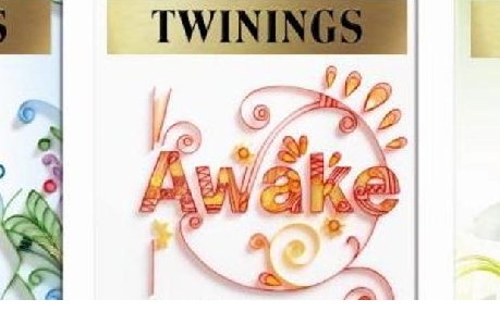
Design agency BrandOpus has designed the packaging for a new range of premium fruit and herbal infusion teas from Twinings

The brand has reorganised its Infusions portfolio and turned to BrandOpus to simplify and redefine the packs. The agency has introduced a clean, white background across all four sub-ranges within the infusions portfolio. Each blend also features swirling imagery to reflecting the moment that the tea infuses into hot water.
According to BrandOpus, the new Fruit Infusions range uses bold typography, real imagery and illustrative touches to signify the "hit of great flavour that the fruity blends create on the palette".

BrandOpus chief executive Nir Wegrzyn said: "Following on from the strategy we created for Green Tea, Twinings Infusions has been transformed from a fragmented portfolio to a simple strategy that is easy to navigate on shelf."


