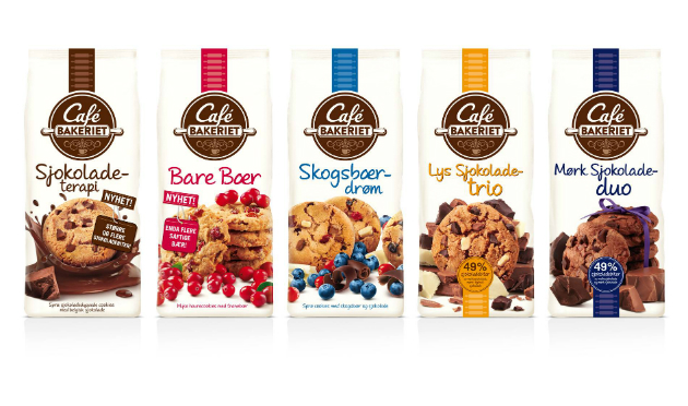
The new look for the Norwegian cookie brand coincides with an improved product recipe and refreshes the overall Café Bakeriet brand identity as well as the individual pack designs across the 5-strong cookie range.
Café Bakeriet is one of S?tre's best selling brands as well as being amongst the strongest perceived brands in the biscuit category.
Pi Global were briefed to instil the brand identity and pack designs with an authoritative, honest yet down-to-earth "bakery feel" in line with the brand's core values and to highlight the generous inclusion of high quality ingredients like chocolate and berries used in the cookies.
According to Pi, it was also important to ensure a very strong differentiation between variants, a strong shelf standout for the whole range and to draw attention to the improved recipe.

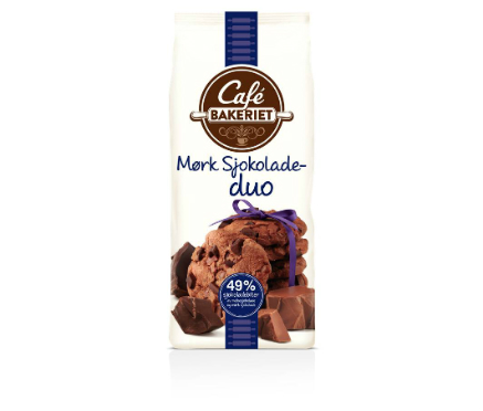
The pi global design team crafted more finesse, depth and personality into the brand marquee which stands out on the off-white background. The light background also creates a canvas for a real celebration of the ingredients and the cookies themselves.
The variant descriptors have been given a handwritten yet very legible feel, and the 'new' tags and chocolate content seals were made to look like elements that you might find in your local bakery.
Lee Purvis, senior designer at Pi Global, said: "By decluttering the design on the pack it allowed us to hero the brand marque, using the negative space around the rolling pin to frame the Bakeriet typography and ?remind the consumer of the brands heritage.
"Illustration within the logo was used to support this but also provide a more visual link between the biscuits and coffee – the brand's key driver. We wanted to communicate the indulgent nature of the cookie; by shooting the product it allowed us to deliver a more luxurious proposition for the brand and allowing the main ingredients within each cookie to shine."
Lise Marie Nordby, brand manager at S?tre, added: "Consumer feedback for our old design was that it looked dated and did not show the variance of the range in a desirable way.
"We wanted to update the packaging and create a stronger link between our biscuits and the latest café trends with a brighter appearance and more focus on ingredients and variation, which the new designs do brilliantly."


