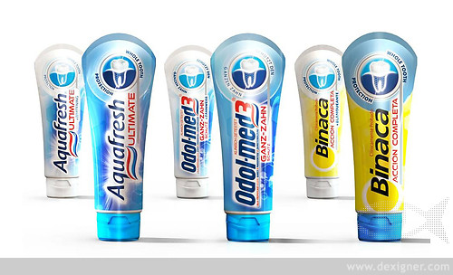
Aquafresh Ultimate,the new''Whole Tooth Protection''flagship brand for GlaxoSmithKline(GSK),is the result of a close collaboration between GSK in-house PacXperience&Consumer Healthcare Futures and strategic brand innovation&design consultancy Webb deVlam.It is already causing considerable disruption in the oral care category.Just launched in the UK following recent successes in France,The Netherlands,Italy and Germany(the first territories in an international roll-out schedule that commenced in March)it has received a fantastic response with demand exceeding all expectation.
New Aquafresh Ultimate toothpaste works to deliver whole tooth protection,by both strengthening the 30%of the tooth you can see,and safeguarding the 70%below the gumline that you can't by helping to keep the gum seal tight.The new platform builds on the reputation of Aquafresh as a family oralcare brand and marries it with the scientific expertise of GSK R&D to create the new proposition.Aimed at the primary consumer–the caring,nurturing mother who purchases on behalf of the health of her family–Aquafresh Ultimate appears in an innovative packaging format with strong graphics that employ semiotic codes to communicate its efficacy and premium positioning.

Webb deVlam worked very closely with GSK to create the flagship variant for the Aquafresh brand–bringing together the teams collective experience in Consumer Discovery,Innovation and Design to determine consumer perceptions and attitudes,translating the research insights into the tangible,meaningful platform identity and pack design that resulted in Aquafresh Ultimate.The objective was to drive the scientific credentials of the Aquafresh brand by launching a paste that competes in the premium segment of the category.
The Aquafresh Ultimate team has devised a number of innovations that will change how toothpaste products are sold and how the packaging functions.
Category DisruptionFirstly,the launch of Aquafresh Ultimate creates significant disruption in-store.It is the first brand in the UK toothpaste category where the primary packaging–the tube,is the hero at the point of purchase.The category convention of the tubes being horizontally merchandised within a secondary carton has been challenged by Aquafresh Ultimate dispensing with the need for the carton and the distinctive tubes being displayed vertically in a shelf-ready tray.The effect is to create visual disruption and standout from the wall of competitor cartons.The presentation promotes the brand with the'halo'icon at the top of the pack with the curved end seal profile facing the consumer.The SRP features a 3-dimensional fresnel lens to highlight the benefits,this is another first in the category and draws upon Webb deVlam's experience of using this cutting edge technology for Bombay Sapphire packaging.
Pack Benefits Aquafresh Ultimate is packaged in a self standing tube for which Webb deValm supported the concept development phase of the''stay clean''flip top cap.The cap features a distinctive white nozzle indicating a healthy tooth surrounded by an Aquafresh wave shaped translucent hinged cap to represent a healthy gum and''whole tooth protection''above and below the gum line.
The tube itself is made from polymer barrier laminate(PBL)which keeps it's shape even when most of the product is dispensed and features a rounded end seal,that emphasises the circular benefit illustration.
Semiotic CodesAquafresh Ultimate uses graphic cues to communicate and educate.Webb deVlam has drawn focus to the Aquafresh Ultimate logotype executed in a specially designed scientific typeface and the technical,yet friendly,depiction of a healthy tooth and gum line to communicate the benefit.Semiotic codes are used in the form of a circular frame to communicate whole tooth protection,safety and security for the family.Meanwhile the depiction of a healthy tooth magnified in a silver foil-blocked''dentist’s mirror''suggests professional quality.There are also subtle allusions to scientific hexagonal symbols to indicate Aquafresh Ultimate's scientific credentials.
The Ultimate variants visual identity remains the same in GSK's international markets where it is branded as Odel-med3 in Germany and Binaca in Spain,ensuring the positioning and communication are consistent.
Environmental BenefitsThe elimination of the carton has already produced some remarkable results in environmental benefits.GSK estimate the elimination of this secondary packaging will save 2240 trees and avoided using 320 tons of paper.
''The objective of the project was to drive the scientific credentials of the Aquafresh brand,''commented Simon Ritchie,Packaging Design&Ideation Director of GSK Consumer Healthcare.''In combination,the packaging design brief was to support this proposition by delivering differentiation and disruption at the point of purchase.In order to establish the'Ultimate'platform as the flagship product for the brand moving forward it was essential to change the format proposition and engage via a benefit driven graphical design.Webb deVlam's support enabled us to achieve this goal.''
''Aquafresh Ultimate's sales performance to date demonstrates the benefits of GSK's integrated approach to innovation,with the multi-functional team all collaborating,sharing expertise and driving the vision forward together,''said Tim Corvin,Client Service Director,Webb deVlam London.''It is an excellent demonstration of how Webb deVlam's collaborative and strategically integrated approach to Discovery,Innovation and Design helps deliver remarkable brand performance.Aquafresh Ultimate not only creates a memorable and desirable new toothpaste product,it also establishes a new Aquafresh platform that gives the umbrella brand authority at every point of consumer engagement.''

Original post:
GSK and Webb deVlam Collaborate to Create Aquafresh Ultimate Brand Architecture and New Pack Format


