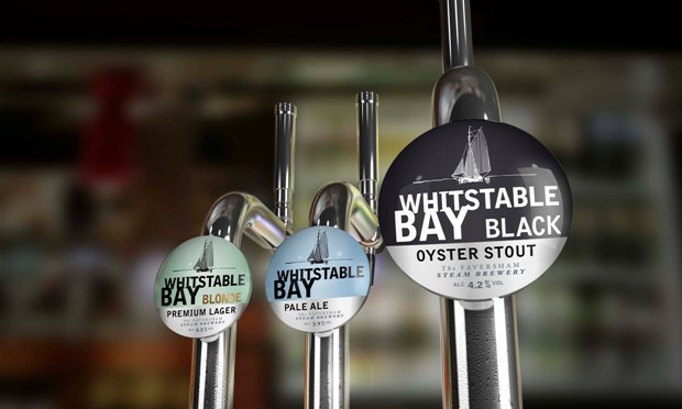
The new branding features a white oyster dredger silhouette on a black background, reflecting the coastal town of Whitstable in Kent.
The name was chosen to complement the existing Whitstable Bay range and by drawing upon the heritage of the town and its famed oysters.
Velda Croot, business development manager at JDO, said: “We were thrilled to be asked to extend the design and develop a brand identity and lens design for Whitstable Bay Black. Whitstable Bay is a great range that we’re really proud of and it’s testament to the success of the range that we are now able to develop further brand extensions.”
Source:
http://www.packagingnews.co.uk/design/new-packs/jdo-designs-branding-whitstable-bay-drinks/


