Branding and packaging design consultancy BOS was asked to work on the rebrand of Westons Wyld Wood following their successful launch of Westons Old Rosie in 2012.
The brief was to amplify existing assets and create personality around the brand.
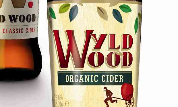
According to BOS, Westons Organic Cider offering has only been called Wyld Wood since 2011, but its first incarnation was not clear enough for consumers who thought that the brand was ‘W’ and missed the core message that the cider was organic.
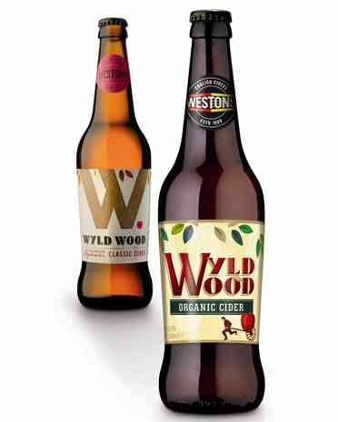
BOS was briefed to redesign the Wyld Wood brand by amplifying the existing brand assets and adding some personality and charm.
In a statement, BOS said that the use of the man with the apple/pear cart has created “some much-needed personality for this brand with the textures and colours used retaining its premium organic quality”.
The bottle’s label is made from metallic stock and matt “finish to emphasise the quality of the organic offer”, BOS said.
Westons brand manager Matthew Langley said: “This is our organic offering so it is extremely important that the design of Wyld Wood reflects the natural, wholesome approach that we take to producing this cider.
“The design achieves that hierarchy of messages whilst importantly keeping the brand within the Weston’s family look.”
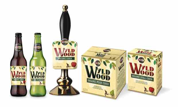
BOS has completed the entire roll out of this design including cases, pump clip, bag in boxes and retail ready trays. BOS has also completed sales presenters for on and off trade and also an exhibition counter.

 Packaging Pouch Machine")
 Packaging Machine Equipment")
 Packaging Machinery Stand up Pouch Machine")
 Packaging Machinery Pouch Machine")
 Packaging Machinery Flat Bottom Pouch Machine")