Supperstudio is a branding agency in Spain whose major client is Supermarket chain, Eroski. So while the agency touts its multi-disciplinary capabilities - “We develop product and service branding projects, packaging, creative solutions for physical environments and retail, branding on digital platforms, advertising and production campaigns, and branding for special events” – a large proportion of its work is home brand packaging.
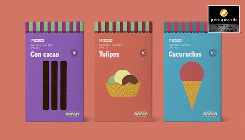
Supperstudio’s packaging for Eroski children’s cereals and overall brand design won two Silver Pentawards this year.
Eroski is a Spanish supermarket chain with nearly 1,000 outlets spread across Spain, excluding franchises. The company was founded in 1969 as a co-operative between ten supermarkets in the region. The worker-consumer co-operative is now part of Spain’s Mondragón Corporation group. Its stores range from 75 massive Eroski hypermarkets, 40 of which have petrol stations attached to 473 smaller Eroski Center stores, plus 219 Eroski City outlets and 234 Eroski Viajes (travel) centres.
Mondragon is one of Spain’s largest companies in terms of asset turnover, a group of autonomous and independent cooperatives with production subsidiaries and corporate offices in 41 countries including Australia and sales in more than 150.
Here are two examples of Supperstudio’s packaging work for Eroski:
Eroski Cooking is the supermarkets chain’s foray into the ready-to-cook market, like The Spice Tailor and Street Kitchen in Australia.
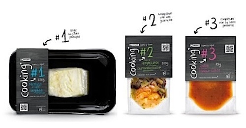
The packaging design follows a simple, ‘handmade’ look, to underline how easy it is to prepare Eroski Cooking dishes, while also emphasizing quality. On the packaging card is QR code that links to a how-to video called Haciendo Cooking.
The design for Eroski children’s cereals depends on simple shapes a nd a single strong colour that matches each cereal to provide standout on shelf.
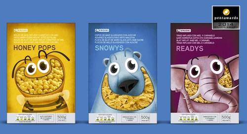
The animals provide kid appeal and build across the range into a zoo to promote trial of different variants. As an added bonus, each animal can be cut out from the box and assembled.
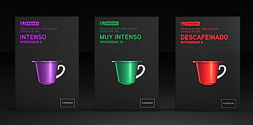
Here is how Supperstudio drew attention to Eroski's coffeecapsule range:
And here is how the studio inspire people to use Eroski pizza bases to make pizza at home


